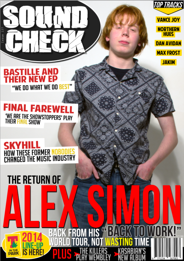
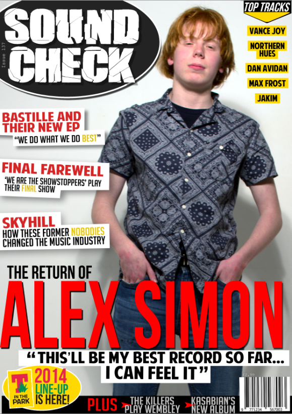
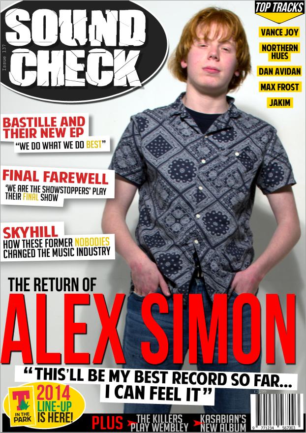
For the first version of the new magazine cover, I decided to create an entirely different cover, rather than modifying the existing one I had. As a template from which I would add the image into afterwards, I first added the masthead at the very top of the page, using the font 'Break It'. I decided upon this font as it has a slight glass shatter effect on an otherwise simple font. I like this effect as it does not have too much of a prominant presence so that it appears overbearing, but still has a strong enough impact to emphasise the fact that it is a masthead and that it is the name of the magazine.
I included the name of the subject of the magazine cover 'Alex Simon' in large red letters on the lower half of the image. The 'imon' part of the text is slightly smaller to accomodate a pull quote underneath. In addition, the subheading 'Back from his world tour, not wasting time' is placed in the small space between the headline and the 'plus' banner at the bottom of the page. The plus banner itself is comprised of a black box, red text which says 'plus', two red arrows and some contrasting white text giving additional stories which will be inside the magazine.
I included the necessary information at the top of the page, directly below the masthead. Once again, drawing from the audience research that I have previously conducted, I chose to price the magazine at £2.99. The barcode has been included in the lower right hand side of the image, following the convention of many other music magazines.
I wanted to include sell lines down the left hand side of the page, using contrasting colours which suited the colour scheme of black, red and white. I made the sell line red and then the subheading underneath black.
Finally, I included a logo for T-in the Park, a popular music festival, as well as an advertisement stating that the line-up for this year's festival had been announced. I was careful to match the colour scheme to that of the original logo, incorporatinf the yellow background followed by the red, green and black text.
In future versions of this cover, I'd like to decrease the size of the necessary information below the masthead as it appears rather large in its current form. I'd also like to change how I am positioning the sell lines down the left-hand-side of the page.
In this version, I have decided to reduce the size of the necessary information below the masthead, as the previous version looked far too large and detracted from the overall look of the magazine cover.
I also added two more sell lines to the left hand side of the page, underneath the original. I tilted the sell lines and the subheadings for each so that the magazine didn't come across as too linear. I added white boxes onto the backgrounds of these sell lines and subheadings so that they stood out from the rest of the background.
I think I am now ready to add the main picture to the cover and will rearrange the layout and text accordingly based on this addition.
The main image has been placed onto the cover. I have adjusted the masthead to accommodate this new addition, splitting the word 'soundcheck' in two, with 'sound' on one line and 'check' on another. I repositioned the necessary information because of this, moving the issue number to the right hand side of the masthead, and moving the issue price above the barcode.
I have added a white stroke effect to the pull quote to allow it to stand out from the image and not blend into the background too much. In my opinion, the layout accommodates the new image very well, being very subtly laid out around the main image. In future versions, I will try experimenting with the masthead, as I do not believe that it is effective in its current form.
I have changed the font of the masthead 'Sound Check'. Personally, I believe that this font is far less effective than I had previously hoped. From this, I would like to think that the issue with the masthead is the fact that it is placed there with no background, meaning that, compared to the sell lines below (which do have backgrounds), it does not stand out. I will experiment with adding a background to the masthead in future versions.
One thing I have picked up on is the lack of content in the upper-left of the magazine cover. In future versions, I will also experiment with trying to add content to this area.
In this version, I acted upon my previous criticism and reverted the masthead font back to its original form and added a red background. In my opinion, this looks far better than the previous version, as now the masthead has a chance to stand out on the page. Despite this, however, I feel as if the overall look of the masthead is too similar to that of a tabloid newspaper. I will continue experimenting with the masthead in future versions.
To rectify the problem regarding a lack of content in the upper-right corner of the image, I have added an advertisement announcing that there is a "FREE ALBUM" inside, one of the positively-received suggestions I included within my aforementioned audience feedback survey. I do not believe this addition works, however, and will most likely either replace it with a feature article within the magazine or more artists that are featured inside to attract as many people as possible.
As described in the previous criticisms, I removed the red background entirely, but once again believe that the masthead does not stand out enough. I will continue experimenting with different backgrounds in future versions.
I added a feature article to the upper-right of the cover, but think this blends in far too much with the background of the image. I could try modifying the colouring of the image to see if the text appears any clearer, or perhaps I could change this section entirely to feature more artists as initially suggested.
One minor thing which I also decided to change is the addition of the yellow text within the sell line tag lines, emphasising certain words. This blends in with the cover's colour scheme, but also follows a key convention found on many music magazines.
The main image now appears more white and overall of greater quality due to the colouring being modified. Now, the subject is against an entirely white background, following the convention found in many popular music magazines. This then allowed me to include a black oval background behind the masthead, contrasting with the now white background of the main image. This new masthead design looks very appealing, and I am very happy with the finished result.
In addition, I added a black/yellow design to the upper-right corner, consisting of an arrow pointing downwards into a list of artists that will also feature inside the magazine, prompting more people to purchase the magazine. The list is small enough so that it does not intrude on the overall look of the magazine cover, but stylised enough so that it catches the attention of those of whom the magazine is aimed towards.
In my opinion, I believe the lower half of the image is far too clustered, and far too text heavy, especially the pull quote, as it lies amongst another tag line as well as the main headline itself.
To rectify the concern I had with the lower half of the image, I removed all of the text and replaced it with a simple pull quote from the article inside the magazine. This addition is still very effective, as it gives information about the article, but not featuring so much text that it appears overbearing. I also reduced the size of the 'PLUS' bar at the very bottom of the page in an attempt to free up as much space as possible. Despite the improvements the pull quote has made, I feel it does not work too well in its current form, perhaps requiring tilting like the sell lines are.
In addition, I added a drop shadow to all three sell lines on the left-hand-side, ensuring they stand out against the white background, which (as we saw in the previous design) detracted the desired effect from them.
In this version, I have acted upon previous criticisms and tilted the pull quote so that now it also takes up the space left behind by what was once the tag line. This is, in my opinion, a far more effective layout style for the pull quote, as it stands out where it is, but, unlike the previous tag line, far less intrusively.
The only minor improvement which I decided to change in this version was the slight rewording of the 'The Killers' story in the 'PLUS' bar at the bottom, changing the word 'Play' to 'At', enabling both stories to appear very symmetrical and rectangular. This change meant that the arrows corresponding to them both could be slightly rearranged too. I did this by making them bigger, as well as ensuring they were placed to the left of each, but still overlap the text slightly.
In my opinion, I am very happy with this design, and cannot think of a single thing that I would like to change about it at this present moment in time. I believe it conforms to most of the conventions required to produce an effective music magazine cover, as well as incorporating unique elements to give my cover an identity of its own and stand out to my target audience.


No comments:
Post a Comment