Wednesday 7 May 2014

Recreation Evaluation

1. In what ways does your media product use, develop or challenge forms and conventions of real media products?

My media product utilises many key conventions found within real media products, more specifically music magazines. For example, on the main cover, I have utilised a large typeface to emphasise the name of the artist who will be the main focus of this issue, or at least have a feature article within the magazine. I have also adopted an image which portrays the subject in an intimidating and confident pose to give the reader the impression that the artist is perhaps planning something, or perhaps implying they are behaving confident for a reason, but not explicitly specifying what this reason is. This, in turn, is likely to prompt the reader to go and pick up a copy of the magazine to find out why an artist which is rather famous is behaving in such a way. This is a convention found across most magazines, not necessarily exclusive to musically-orientated ones. It does, however, challenge conventions, using a circular background behind the masthead, whereas most magazines either do not utilise a background behind the masthead, or resort to a rectangular one. In my opinion, I do not believe the shape of the background detracts from the overall effectiveness of it.

For the contents page, it uses a very linear and organised structure which is immediately obvious upon first viewing. It is filled with information, featuring as many possible artists and gripping previews of articles within the magazine. This large amount of information is a common convention within magazine contents pages, especially music magazine contents pages. Aside from this, the fact that there is no 'main' story featured on the contents may be considered a convention, or may be seen as challenging conventions. In my opinion, this helps the overall look of the contents page by not including one 'main' article to focus on, and I believe this is a convention of other music magazine contents pages. One aspect which may seem to be challenging a traditional convention is the inclusion of the 'Contributors' section, which may not necessarily always be found within a music magazine, especially on the contents page. Despite this, however, I believe that the inclusion of this section works very well, giving the audience a sense of connection with those who have worked on the magazine. As well as this, it is also written slightly informally and light-heartedly so to fit in with the rest of the magazine's writing style.

My double-page spread follows the convention of traditional music magazines, by featuring a rather simplistic layout style. It features just three colours, black, white and red. The image is also placed in a rather simplistic fashion, not overlapping to the other half of the page. I have also included the credits to the writer and photographer who worked on the respective pieces for the article, a convention found either at the beginning or end of a music magazine article on a double-page spread. The fact that the image itself is in black and white, however, may be considered challenging the conventions of traditional double page spreads, as a double page spread, especially in a music magazine, isn't expected to adopt such a sombre, melancholy tone. Despite this, however, I believe this fully works in the design's favour, as the article itself is quite toned down, informal and overall not 'zany' enough to warrant an over-exaggerated, overly-colourful image.

2. How does your media product represent particular social groups?
My music magazine focuses primarily on representing the artists within the music industry, but also indirectly represents particular social groups through the imagery, language usage etc. The magazine, as a whole, adopts a very informal tone regarding its use of language. This is far more likely to appeal to a younger audience (i.e. my target demographic) because of the light-bearded and lack of a serious tone. The imagery is also likely to appeal to this target audience because of the intimidating and interesting mannerisms the subjects of the images express through their poses. Regarding how this represents a particular social group, it is clear to see that a younger social group is far less likely to read long, monotonous articles, showing how they may have a short attention span - this can be justified by the informal, to-the-point layout of the magazine, ensuring that there isn't a moment where the reader becomes bored with the text.

3. What kind of media institution might distribute your media product and why?


4. Who would be the audience for your media product?
The target audience for my media product would be typically young adults, specifically those interested in reading about new or upcoming artists within the music industry. Because there are several different genres of music, I considered it would be easier to stick to one specific type of genre. In this case, I decided to pick the genre of alternative/indie rock, genres popularised by publications such as NME and Q, of which I have already researched. Based on these two scenarios, I have determined that the key demographic for my music magazine are young adults/teenagers (typically in the age range 16-30) who would also be interested in alternative/indie rock, and have designed and produced my magazine in accordance with this in mind, using informal/light-hearted language to help the reader feel comfortable with the text and therefore less likely to lose interest.

5. How did you attract/address your audience? 
One of the main ways that I attracted my audience was through the use of the abundance of artist names throughout the magazine. I ensured to feature names of various artists prominently on my main cover and my contents page, hopefully with the intention of attracting the attention of as many people as possible. The target audience is far more likely to purchase a copy of the magazine if they saw the name of an artist they followed or were interested in reading about, hence the reason there is a large emphasis on featuring as many different artists as possible, thus appealing to as many people as possible

In addition, I have also ensured that I use simplistic designs on the Double-Page Spread to make the otherwise overbearing article easy-to-read, maintaining the focus of the audience. On the contents page, I adopted a far more complex design, but still emphasises certain parts such as the main articles and features within the magazine to help emphasise the parts of the contents which are important and should be referred to for more insight into the articles. I have also used the band list to appeal to the audience, as it is unlikely they would want to read through the entire magazine to find an artist they were interested in reading more about.

6. What have you learnt about technologies from the process of constructing this product?

7. Looking back at your preliminary task, what do you feel you have learnt in the progression from that to your full product? 
When comparing the progression of my finished product to my initial preliminary tasks, it is clear to see just how much the work has improved. One of the major things which I have believe I have learned is the importance of font. Font is one of the main components which makes up a magazine, and often goes overlooked. In my finished product, I have used bold, gripping fonts where necessary (such as the masthead and main sell line on the cover page), but merely used the same font throughout essentially all of the preliminary task. This, obviously, made for a very unprofessional looking product. Another obvious design feature which I realised the importance of is the colour scheme. In my preliminary task, I used black and white, but used no other colours alongside it, meaning the only other colours present were from the images used, which did not complement the colour choices I had already been using. Specifically regarding the contents page, it is clear that I learned the importance of the abundance of information, as including lots of artist names etc. onto it helps make it appear more professional and conventional, as well as showing the reader which bands will be featured within the magazine. Upon seeing a band that they recognise or enjoy, the reader is far more likely to retain interest in the magazine and read further. The preliminary task just seemed to lack this abundance of information. With the highly basic colour scheme, there is nothing eye-catching or interesting about the contents page. The only aspect of the preliminary design which appears to even slightly resemble a professional design is the layout, with the design on the preliminary contents page adopting a colum-like structure, as well as pictures that are accompanied by short previews. There appears to be little resemblance to a real media product, and I believe that after researching several existing media products and carefully noting the conventions of each, I have produced products of much greater quality than my initial preliminary tasks.


Tuesday 6 May 2014

Magazine DPS Further Development

For this initial design, I decided to focus on the text layout first, placing the article title and small introduction at the very top of the right page. I made the 'for Alex' part of the text larger than the 'Back to work' to emphasise the name of the artist, a convention which is likely to grab the attention of the reader. I decided to underline the preview to ensure it is differentiated from both the article title and the eventual article itself.

In this version, I added the actual article. Separated into two columns and justified, I believe the layout of the article suits the conventions of a traditional double-page spread. Now that I have the basic template laid out for the DPS, I will start incorporating the other elements which I discussed in my flatplans. Upon adding these features, I will try modifying the existing ones to see how I can improve the design further.

For this version, I added the two remaining features which I had detailed in my flatplans, the main image and the pull quote. Much like the previous DPS design, I have placed the main image on the left page, and the article and writing on the right page. This time, however, the background stretches across both pages. This is a convention which I did not utilise within my previous design. In my opinion, having the background span both pages is very effective and does not create the segregated look that the previous design had, with this one looking far more natural and conventional. The pull quote is placed in the top left of the DPS, in an almost circular shape so that it does not intrude too much on the overall design.

Now that all necessary components have been added, I can start to modify these components to help make the DPS even more effective. One of the major things which I noticed about the previous design was the fact that, despite being in a much larger font, the article title did not stand out at all in its previous form on the page. To rectify this, I decided to add black backgrounds to both lines, 'Back to Work' and 'for Alex'. This, in my opinion, works far better, further highlighting the plain black and white theme present because of the contrasting text colour and background.

An improvement which I believe I could make would be to modify the colouring of the main image to an entirely black and white image to suit the colour scheme of the rest of the image.

As suggested previously, I have changed the colouring of the main image to black and white. In my opinion, the current version, because of this change, does not work very well, and the bright white background contrasts heavily against the new monochromatic image. To rectify this, I plan on changing the colour of the background to a greyer colour, one that stands out far less than the current pure-white background.

In this version, acting on the improvements I made in my previous version, I modified the colour of the background to ensure it is a much darker shade, almost grey. I have not made it too dark so that it takes away the impact of any of the text, but I have made it darker so that now the whole piece seems to blend together far more successfully.

The final component which I have decided to add to the piece is the inclusion of the page numbers, as well as the small text at the very bottom of the right-hand page reading "Alex Simon | Soundcheck", thus following a convention which I utilised within my contents page. In my opinion, these minor additions create a very significant improvement on the overall piece, making it look like a far more cohesive and complete piece with the additions of these text elements.

One major improvement which I believe I could change, however, is introducing some colour into the piece. Unlike the contents page and main cover, I believe that introducing too much colour would detract from the simplistic nature of the DPS, and therefore I should stick with a minimalistic colour scheme, perhaps introducing one colour to the piece, such as red.

In this piece, I have decided to modify a few things. One element which I modified is the article title, changing the lower case, simplistic font into a capitalised square font instead. This helps to differentiate the title from the introduction directly below, and I believe this new change works very well. Regarding the introduction, I have added more text into it, seeing how the text would look if it were to follow a more pyramid-like structure. In my opinion, this works well, giving a slight extra amount of information about the article, but still laid out in such a way that it is clearly an introduction.

I have changed the drop cap to a large letter I accompanied by a preceding speech mark. This is then made slightly transparent and placed behind a portion of the left column, a common feature in many music magazines. The speech mark also extends across both pages, a convention which I also picked up on in my DPS deconstruction. Having the speech mark stretch across both pages creates a sense of cohesion between the two pages, further cementing the fact that the DPS is a whole design, and not comprised of two separate pages.

Regarding the colours, I acted upon my previous suggestion and added two instances of the colour red, one on the drop cap and one of the pull quote. Both of these colours work very well against the grey background, I do not believe they would have been effective against the bright-white background.

In addition, I have added more text to the actual article itself to give the whole piece a more informative look, much like that of an actual magazine article. I also decided to include the writer of the article and the photographer who took the main image, following the conventions found in almost all music magazines.

Minor changes include changing the page numbers so they follow the continuity compared to the number I gave the contents page, a minor change but will help to maximise the amount of conventions used within the piece.

Overall, I am very happy with the finished design, and believe this finished design follows all necessary components of a music magazine, but once again incorporates unique elements to make the piece different and therefore far more likely to appeal to my desired target audience.

Monday 5 May 2014

Magazine Contents Further Development

In this initial version, I focused on getting the general layout of the contents page down. I drew lines throughout the document, which would help me to see exactly where each individual component of the contents page would be located. I included the magazine's logo (used in the masthead on the main cover) without the background to ensure that there was a sense of cohesion throughout all three pieces of magazine design. I opted for the colour scheme of red/white/black, similar to that of the main cover. This, once again, cements this idea of cohesion between the three pieces.
In this second, more completed version, I finished many of the major components within the contents page, emphasising the necessary parts using larger fonts, backgrounds, capitals etc. In my opinion, this layout looks very nice and professional, with no one section appearing too overbearing. By keeping all article previews short, they appear inviting, but do not give too much away about the article itself.

One improvement which I decided to make was the change of the background on the 'Reader's Poll' section due to the fact that the original black background conflicted with the black background of the 'The SC Band List' directly underneath. In my opinion, the yellow still works used in this instance, as it is used for highlighting information, similar to its usage on the main cover.
On the far right of the page, I am including a list of all of the bands featured within the magazine. While, at first, this may seem like an overwhelming amount of information to look at, I believe that this is vital for a contents page, showing the reader that there is a large number of bands featured within the magazine, and the reader can browse for some of their favourites if they so wished.

In this version, I have finished the band list and have begun work on the bottom of the image, including a section which lists a few contributors to the magazine, accompanied by a small picture and description of an experience they have with music.

In addition, I have added page numbers and a small, transparent piece of text at the very bottom of the page listing the name of the magazine, as well as the fact that it is a contents page. This is a common convention found on mostly all pages within a music magazine (excluding the main cover), and I believe that it works very well on this page.

In this version, I have finished arranging the 'Contributors' section, and I believe that this large amount of text, while not necessarily appealing to the reader, conforms to the key conventions of a contents page by making it appear as if there is a lot of information present, as well as being written in such a way that it appeals to the target audience by being written in a light-hearted and informal tone.

The final major addition to my contents page is the subscription advertisement to the magazine. This advertisement features the font which is present in the logo. Despite the logo appearing at the top of the page, this stands out from the rest of the contents page because of the use of this scarcely-used font. I also used a slightly-transparent red rectangle shape and placed it over the four corners of the advertisement as this gives the effect that the advertisement is stuck on, giving the advertisement (usually a formal component) a light-hearted tone, thus becoming more likely to appeal to the reader/target audience.

In this version, I decided to carry out a minor change by making the SoundCheck logo bigger slightly, ensuring the logo has a strong presence on the page, but, once again, not so strong that it subtracts attention from other, more important parts of the page. In addition, I decided to add yellow, highlighted backgrounds to the 'Features' column, highlighting the three artists featured in that column as well, as I believed this section appeared to lack emphasis. As well as this, I decided to add slightly transparent numbers behind the text of this section, serving as page numbers, but placed in an informal and light-hearted manner. While this is quite unconventional, I am very happy with the way in which the final version turned out. I increased the size of the page numbers in the central column, allowing them to stand out far more than they were otherwise.

Overall, I am very happy with the design of this contents page, and cannot think of any more possible improvements at this moment in time. It follows many of the major conventions of a music magazine's contents page, as well as incorporating my own unique elements into it.


Magazine Cover Further Development

For the first version of the new magazine cover, I decided to create an entirely different cover, rather than modifying the existing one I had. As a template from which I would add the image into afterwards, I first added the masthead at the very top of the page, using the font 'Break It'. I decided upon this font as it has a slight glass shatter effect on an otherwise simple font. I like this effect as it does not have too much of a prominant presence so that it appears overbearing, but still has a strong enough impact to emphasise the fact that it is a masthead and that it is the name of the magazine.

I included the name of the subject of the magazine cover 'Alex Simon' in large red letters on the lower half of the image. The 'imon' part of the text is slightly smaller to accomodate a pull quote underneath. In addition, the subheading 'Back from his world tour, not wasting time' is placed in the small space between the headline and the 'plus' banner at the bottom of the page. The plus banner itself is comprised of a black box, red text which says 'plus', two red arrows and some contrasting white text giving additional stories which will be inside the magazine.

I included the necessary information at the top of the page, directly below the masthead. Once again, drawing from the audience research that I have previously conducted, I chose to price the magazine at £2.99. The barcode has been included in the lower right hand side of the image, following the convention of many other music magazines.

I wanted to include sell lines down the left hand side of the page, using contrasting colours which suited the colour scheme of black, red and white. I made the sell line red and then the subheading underneath black.

Finally, I included a logo for T-in the Park, a popular music festival, as well as an advertisement stating that the line-up for this year's festival had been announced. I was careful to match the colour scheme to that of the original logo, incorporatinf the yellow background followed by the red, green and black text.

In future versions of this cover, I'd like to decrease the size of the necessary information below the masthead as it appears rather large in its current form. I'd also like to change how I am positioning the sell lines down the left-hand-side of the page.

In this version, I have decided to reduce the size of the necessary information below the masthead, as the previous version looked far too large and detracted from the overall look of the magazine cover.

I also added two more sell lines to the left hand side of the page, underneath the original. I tilted the sell lines and the subheadings for each so that the magazine didn't come across as too linear. I added white boxes onto the backgrounds of these sell lines and subheadings so that they stood out from the rest of the background.

I think I am now ready to add the main picture to the cover and will rearrange the layout and text accordingly based on this addition.

The main image has been placed onto the cover. I have adjusted the masthead to accommodate this new addition, splitting the word 'soundcheck' in two, with 'sound' on one line and 'check' on another. I repositioned the necessary information because of this, moving the issue number to the right hand side of the masthead, and moving the issue price above the barcode.

I have added a white stroke effect to the pull quote to allow it to stand out from the image and not blend into the background too much. In my opinion, the layout accommodates the new image very well, being very subtly laid out around the main image. In future versions, I will try experimenting with the masthead, as I do not believe that it is effective in its current form.

I have changed the font of the masthead 'Sound Check'. Personally, I believe that this font is far less effective than I had previously hoped. From this, I would like to think that the issue with the masthead is the fact that it is placed there with no background, meaning that, compared to the sell lines below (which do have backgrounds), it does not stand out. I will experiment with adding a background to the masthead in future versions.

One thing I have picked up on is the lack of content in the upper-left of the magazine cover. In future versions, I will also experiment with trying to add content to this area.

In this version, I acted upon my previous criticism and reverted the masthead font back to its original form and added a red background. In my opinion, this looks far better than the previous version, as now the masthead has a chance to stand out on the page. Despite this, however, I feel as if the overall look of the masthead is too similar to that of a tabloid newspaper. I will continue experimenting with the masthead in future versions.

To rectify the problem regarding a lack of content in the upper-right corner of the image, I have added an advertisement announcing that there is a "FREE ALBUM" inside, one of the positively-received suggestions I included within my aforementioned audience feedback survey. I do not believe this addition works, however, and will most likely either replace it with a feature article within the magazine or more artists that are featured inside to attract as many people as possible.

As described in the previous criticisms, I removed the red background entirely, but once again believe that the masthead does not stand out enough. I will continue experimenting with different backgrounds in future versions.

I added a feature article to the upper-right of the cover, but think this blends in far too much with the background of the image. I could try modifying the colouring of the image to see if the text appears any clearer, or perhaps I could change this section entirely to feature more artists as initially suggested.

One minor thing which I also decided to change is the addition of the yellow text within the sell line tag lines, emphasising certain words. This blends in with the cover's colour scheme, but also follows a key convention found on many music magazines.

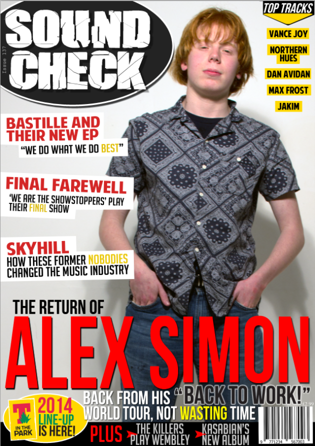
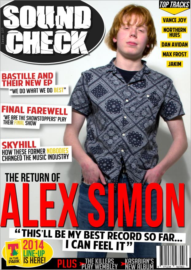
The main image now appears more white and overall of greater quality due to the colouring being modified. Now, the subject is against an entirely white background, following the convention found in many popular music magazines. This then allowed me to include a black oval background behind the masthead, contrasting with the now white background of the main image. This new masthead design looks very appealing, and I am very happy with the finished result.

In addition, I added a black/yellow design to the upper-right corner, consisting of an arrow pointing downwards into a list of artists that will also feature inside the magazine, prompting more people to purchase the magazine. The list is small enough so that it does not intrude on the overall look of the magazine cover, but stylised enough so that it catches the attention of those of whom the magazine is aimed towards.

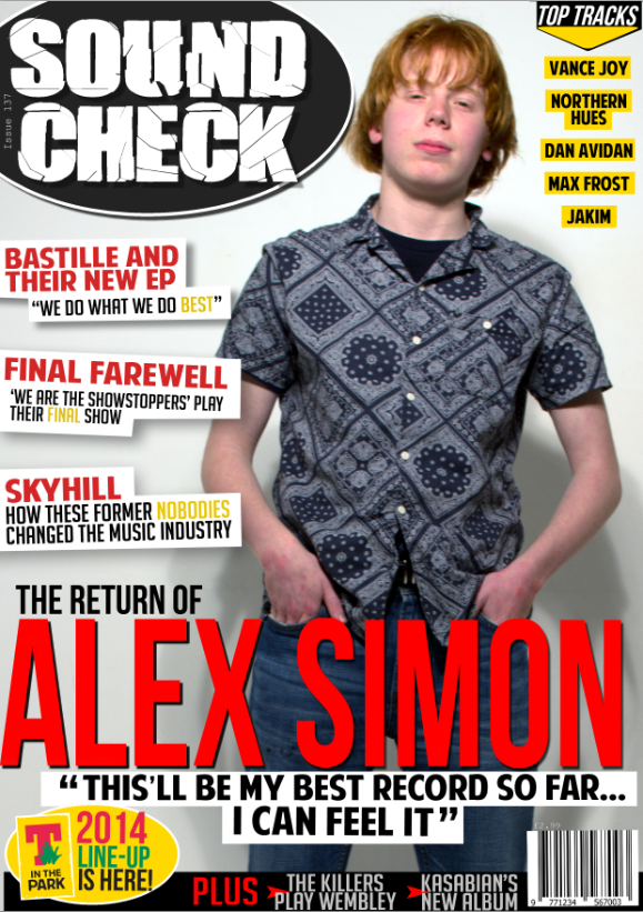
In my opinion, I believe the lower half of the image is far too clustered, and far too text heavy, especially the pull quote, as it lies amongst another tag line as well as the main headline itself.

To rectify the concern I had with the lower half of the image, I removed all of the text and replaced it with a simple pull quote from the article inside the magazine. This addition is still very effective, as it gives information about the article, but not featuring so much text that it appears overbearing. I also reduced the size of the 'PLUS' bar at the very bottom of the page in an attempt to free up as much space as possible. Despite the improvements the pull quote has made, I feel it does not work too well in its current form, perhaps requiring tilting like the sell lines are.

In addition, I added a drop shadow to all three sell lines on the left-hand-side, ensuring they stand out against the white background, which (as we saw in the previous design) detracted the desired effect from them.

In this version, I have acted upon previous criticisms and tilted the pull quote so that now it also takes up the space left behind by what was once the tag line. This is, in my opinion, a far more effective layout style for the pull quote, as it stands out where it is, but, unlike the previous tag line, far less intrusively.

The only minor improvement which I decided to change in this version was the slight rewording of the 'The Killers' story in the 'PLUS' bar at the bottom, changing the word 'Play' to 'At', enabling both stories to appear very symmetrical and rectangular. This change meant that the arrows corresponding to them both could be slightly rearranged too. I did this by making them bigger, as well as ensuring they were placed to the left of each, but still overlap the text slightly.

In my opinion, I am very happy with this design, and cannot think of a single thing that I would like to change about it at this present moment in time. I believe it conforms to most of the conventions required to produce an effective music magazine cover, as well as incorporating unique elements to give my cover an identity of its own and stand out to my target audience.

Photoshoot Compilation

Here is a compilation of the images which I took to eventually feature in my music magazine: