For this initial design, I decided to focus on the text layout first, placing the article title and small introduction at the very top of the right page. I made the 'for Alex' part of the text larger than the 'Back to work' to emphasise the name of the artist, a convention which is likely to grab the attention of the reader. I decided to underline the preview to ensure it is differentiated from both the article title and the eventual article itself.
In this version, I added the actual article. Separated into two columns and justified, I believe the layout of the article suits the conventions of a traditional double-page spread. Now that I have the basic template laid out for the DPS, I will start incorporating the other elements which I discussed in my flatplans. Upon adding these features, I will try modifying the existing ones to see how I can improve the design further.
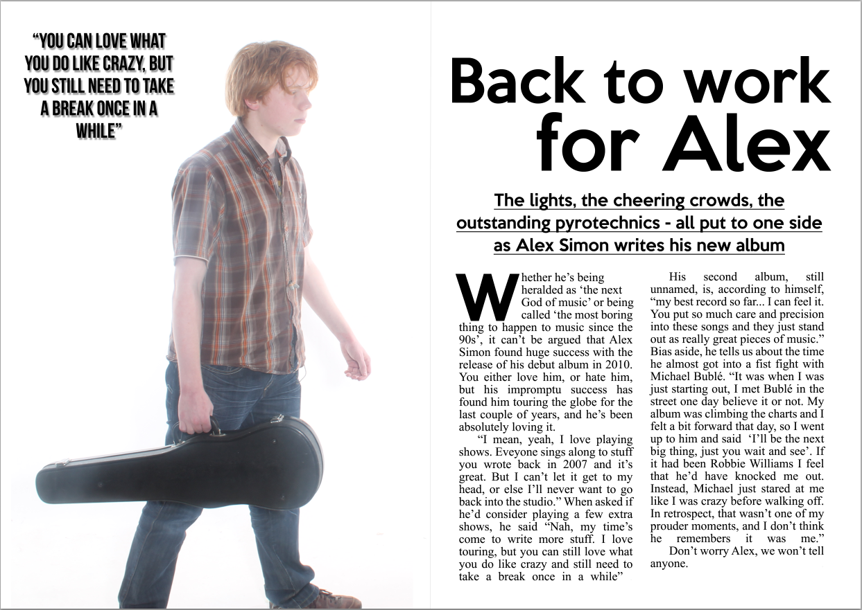
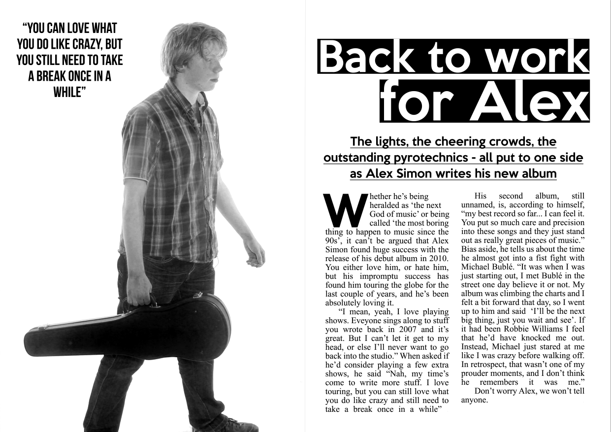
For this version, I added the two remaining features which I had detailed in my flatplans, the main image and the pull quote. Much like the previous DPS design, I have placed the main image on the left page, and the article and writing on the right page. This time, however, the background stretches across both pages. This is a convention which I did not utilise within my previous design. In my opinion, having the background span both pages is very effective and does not create the segregated look that the previous design had, with this one looking far more natural and conventional. The pull quote is placed in the top left of the DPS, in an almost circular shape so that it does not intrude too much on the overall design.
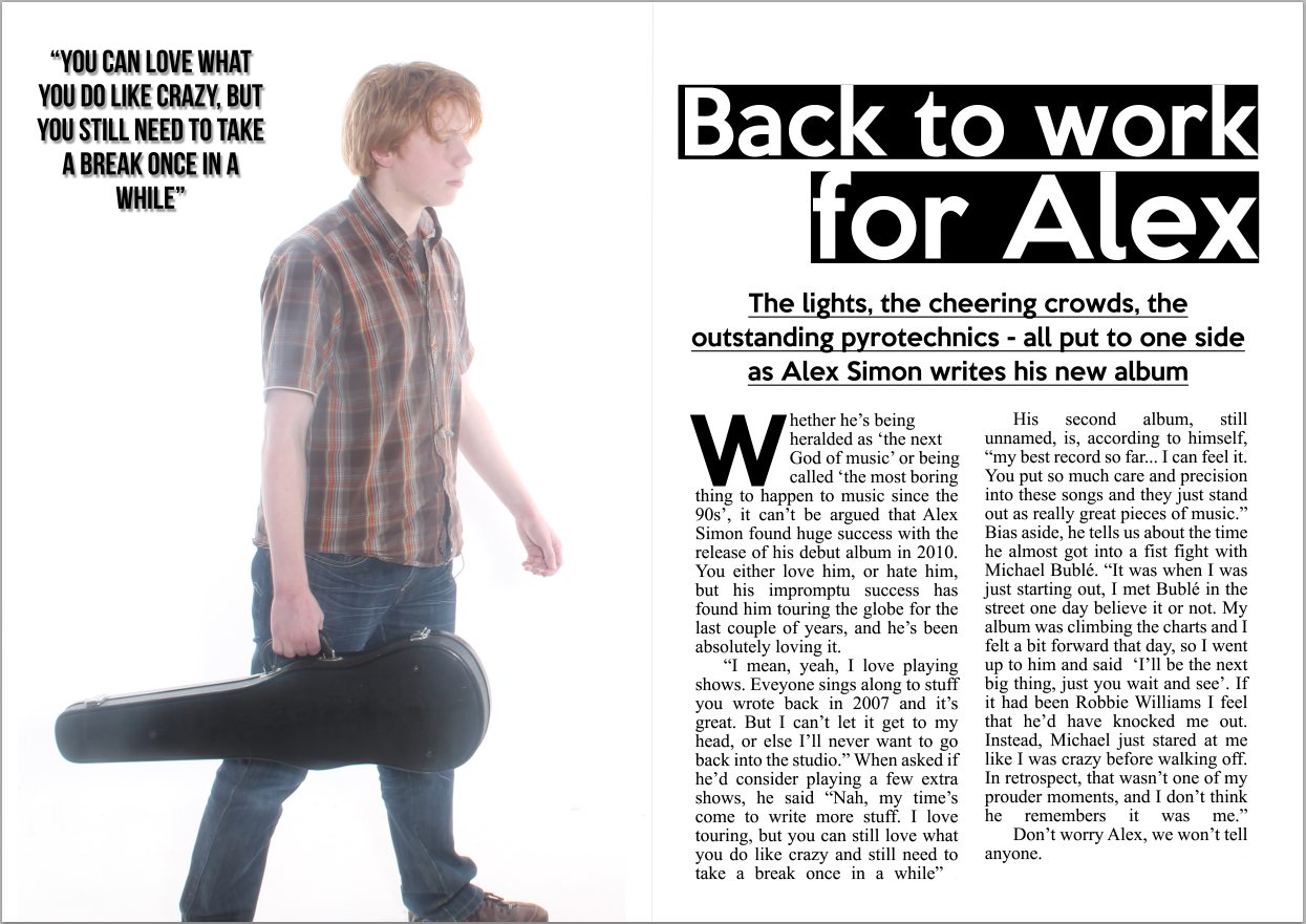
Now that all necessary components have been added, I can start to modify these components to help make the DPS even more effective. One of the major things which I noticed about the previous design was the fact that, despite being in a much larger font, the article title did not stand out at all in its previous form on the page. To rectify this, I decided to add black backgrounds to both lines, 'Back to Work' and 'for Alex'. This, in my opinion, works far better, further highlighting the plain black and white theme present because of the contrasting text colour and background.
An improvement which I believe I could make would be to modify the colouring of the main image to an entirely black and white image to suit the colour scheme of the rest of the image.
As suggested previously, I have changed the colouring of the main image to black and white. In my opinion, the current version, because of this change, does not work very well, and the bright white background contrasts heavily against the new monochromatic image. To rectify this, I plan on changing the colour of the background to a greyer colour, one that stands out far less than the current pure-white background.

In this version, acting on the improvements I made in my previous version, I modified the colour of the background to ensure it is a much darker shade, almost grey. I have not made it too dark so that it takes away the impact of any of the text, but I have made it darker so that now the whole piece seems to blend together far more successfully.
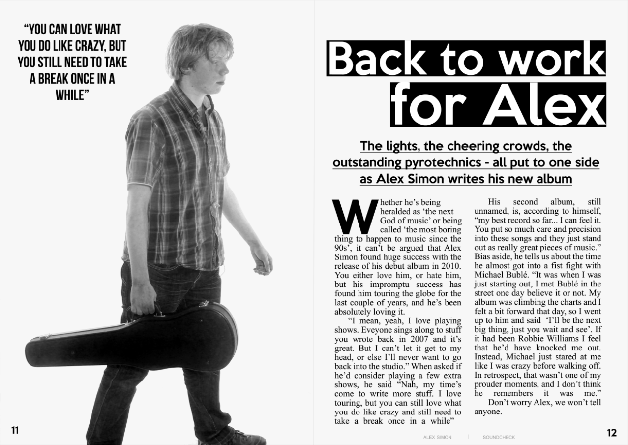
The final component which I have decided to add to the piece is the inclusion of the page numbers, as well as the small text at the very bottom of the right-hand page reading "Alex Simon | Soundcheck", thus following a convention which I utilised within my contents page. In my opinion, these minor additions create a very significant improvement on the overall piece, making it look like a far more cohesive and complete piece with the additions of these text elements.
One major improvement which I believe I could change, however, is introducing some colour into the piece. Unlike the contents page and main cover, I believe that introducing too much colour would detract from the simplistic nature of the DPS, and therefore I should stick with a minimalistic colour scheme, perhaps introducing one colour to the piece, such as red.

In this piece, I have decided to modify a few things. One element which I modified is the article title, changing the lower case, simplistic font into a capitalised square font instead. This helps to differentiate the title from the introduction directly below, and I believe this new change works very well. Regarding the introduction, I have added more text into it, seeing how the text would look if it were to follow a more pyramid-like structure. In my opinion, this works well, giving a slight extra amount of information about the article, but still laid out in such a way that it is clearly an introduction.
I have changed the drop cap to a large letter I accompanied by a preceding speech mark. This is then made slightly transparent and placed behind a portion of the left column, a common feature in many music magazines. The speech mark also extends across both pages, a convention which I also picked up on in my DPS deconstruction. Having the speech mark stretch across both pages creates a sense of cohesion between the two pages, further cementing the fact that the DPS is a whole design, and not comprised of two separate pages.
Regarding the colours, I acted upon my previous suggestion and added two instances of the colour red, one on the drop cap and one of the pull quote. Both of these colours work very well against the grey background, I do not believe they would have been effective against the bright-white background.
In addition, I have added more text to the actual article itself to give the whole piece a more informative look, much like that of an actual magazine article. I also decided to include the writer of the article and the photographer who took the main image, following the conventions found in almost all music magazines.
Minor changes include changing the page numbers so they follow the continuity compared to the number I gave the contents page, a minor change but will help to maximise the amount of conventions used within the piece.
Overall, I am very happy with the finished design, and believe this finished design follows all necessary components of a music magazine, but once again incorporates unique elements to make the piece different and therefore far more likely to appeal to my desired target audience.
No comments:
Post a Comment