In this initial version, I focused on getting the general layout of the contents page down. I drew lines throughout the document, which would help me to see exactly where each individual component of the contents page would be located. I included the magazine's logo (used in the masthead on the main cover) without the background to ensure that there was a sense of cohesion throughout all three pieces of magazine design. I opted for the colour scheme of red/white/black, similar to that of the main cover. This, once again, cements this idea of cohesion between the three pieces.
In this second, more completed version, I finished many of the major components within the contents page, emphasising the necessary parts using larger fonts, backgrounds, capitals etc. In my opinion, this layout looks very nice and professional, with no one section appearing too overbearing. By keeping all article previews short, they appear inviting, but do not give too much away about the article itself.
One improvement which I decided to make was the change of the background on the 'Reader's Poll' section due to the fact that the original black background conflicted with the black background of the 'The SC Band List' directly underneath. In my opinion, the yellow still works used in this instance, as it is used for highlighting information, similar to its usage on the main cover.
On the far right of the page, I am including a list of all of the bands featured within the magazine. While, at first, this may seem like an overwhelming amount of information to look at, I believe that this is vital for a contents page, showing the reader that there is a large number of bands featured within the magazine, and the reader can browse for some of their favourites if they so wished.
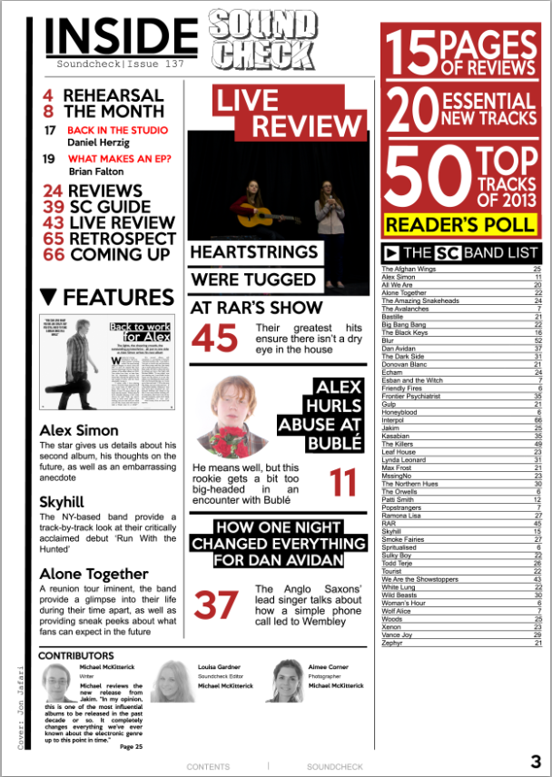
In this version, I have finished the band list and have begun work on the bottom of the image, including a section which lists a few contributors to the magazine, accompanied by a small picture and description of an experience they have with music.
In addition, I have added page numbers and a small, transparent piece of text at the very bottom of the page listing the name of the magazine, as well as the fact that it is a contents page. This is a common convention found on mostly all pages within a music magazine (excluding the main cover), and I believe that it works very well on this page.
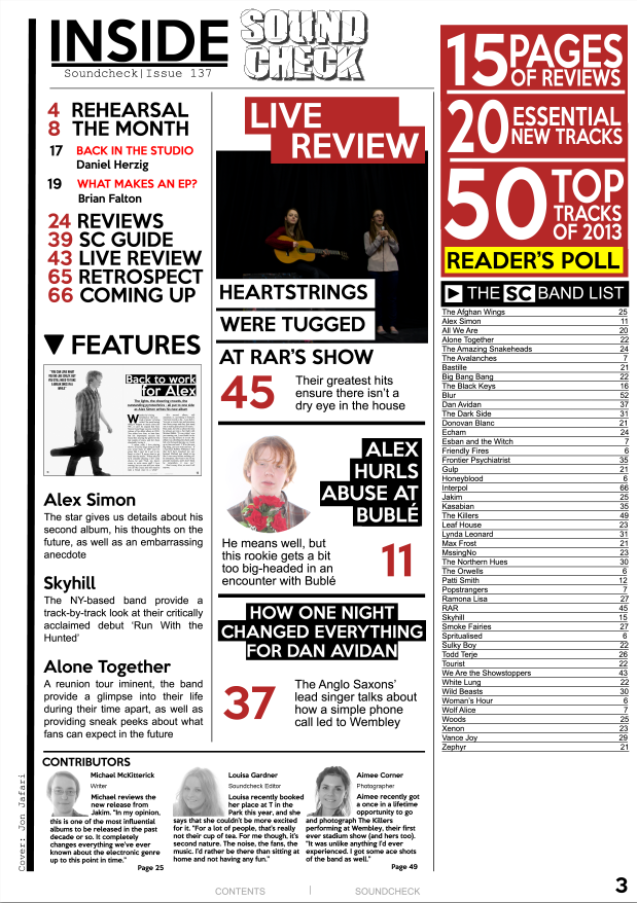
In this version, I have finished arranging the 'Contributors' section, and I believe that this large amount of text, while not necessarily appealing to the reader, conforms to the key conventions of a contents page by making it appear as if there is a lot of information present, as well as being written in such a way that it appeals to the target audience by being written in a light-hearted and informal tone.
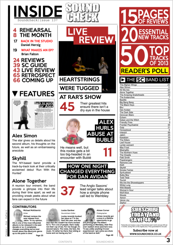
The final major addition to my contents page is the subscription advertisement to the magazine. This advertisement features the font which is present in the logo. Despite the logo appearing at the top of the page, this stands out from the rest of the contents page because of the use of this scarcely-used font. I also used a slightly-transparent red rectangle shape and placed it over the four corners of the advertisement as this gives the effect that the advertisement is stuck on, giving the advertisement (usually a formal component) a light-hearted tone, thus becoming more likely to appeal to the reader/target audience.

In this version, I decided to carry out a minor change by making the SoundCheck logo bigger slightly, ensuring the logo has a strong presence on the page, but, once again, not so strong that it subtracts attention from other, more important parts of the page. In addition, I decided to add yellow, highlighted backgrounds to the 'Features' column, highlighting the three artists featured in that column as well, as I believed this section appeared to lack emphasis. As well as this, I decided to add slightly transparent numbers behind the text of this section, serving as page numbers, but placed in an informal and light-hearted manner. While this is quite unconventional, I am very happy with the way in which the final version turned out. I increased the size of the page numbers in the central column, allowing them to stand out far more than they were otherwise.
Overall, I am very happy with the design of this contents page, and cannot think of any more possible improvements at this moment in time. It follows many of the major conventions of a music magazine's contents page, as well as incorporating my own unique elements into it.
No comments:
Post a Comment